Physician Strategies for Employers
Employers understand less about, and are impacted financially more by, network integrity than any other health economy stakeholder. For decades, employers have assumed that payer networks were intended to minimize, if not lower, the medical costs incurred by their employees through “navigation” and “steerage,” i.e., the tactics by which payers notionally direct employees to providers to improve their network performance.
Health plan price transparency reveals that payers reimburse providers within the same market at highly divergent rates whose correlation with quality is negligible. As a result, network integrity is entirely theoretical for the employer since it is impossible to deliver value for money consistently without creating networks of providers who deliver value for money.
In turn, health plan price transparency reveals this:
Narrow networks do not deliver value.
In contrast to the fervently held belief of payers, brokers, consultants and policymakers, the way to receive value for money is not through steerage to a “narrow” network but rather steering away from a handful of providers.
Use Case: Understanding Variance in Value Across Healthcare Providers
It is axiomatic that “you get what you pay for.” Healthcare is a noticeable exception to the axiom since in healthcare customers and end users rarely know what they bought, what was delivered, what it cost or whether it was any good.
Using several well-known correlation measures to compare common quality measures for high-volume hospital inpatient procedures with the in-network reimbursement paid for them reveals negligible correlation between cost and quality. The result?
In healthcare, a higher price does not guarantee higher quality, and often results in slightly worse quality.
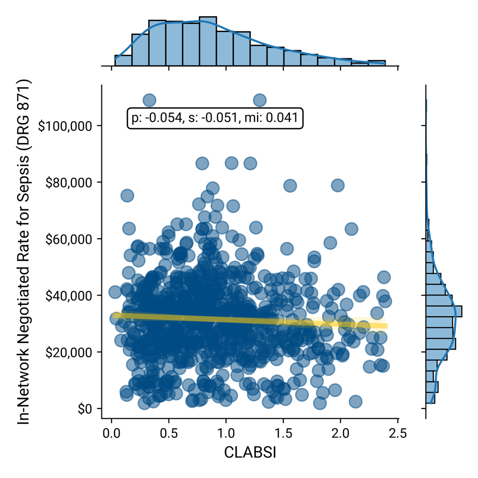
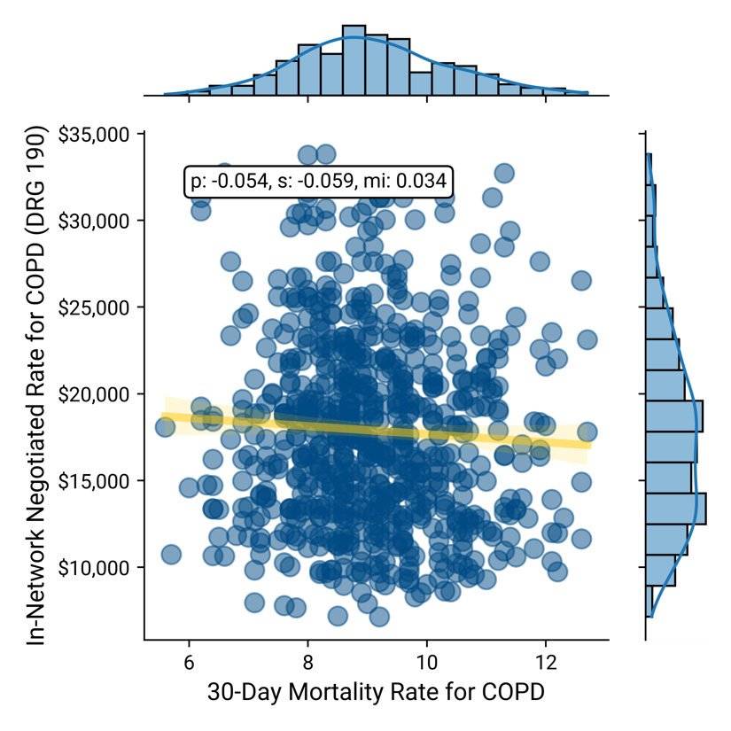
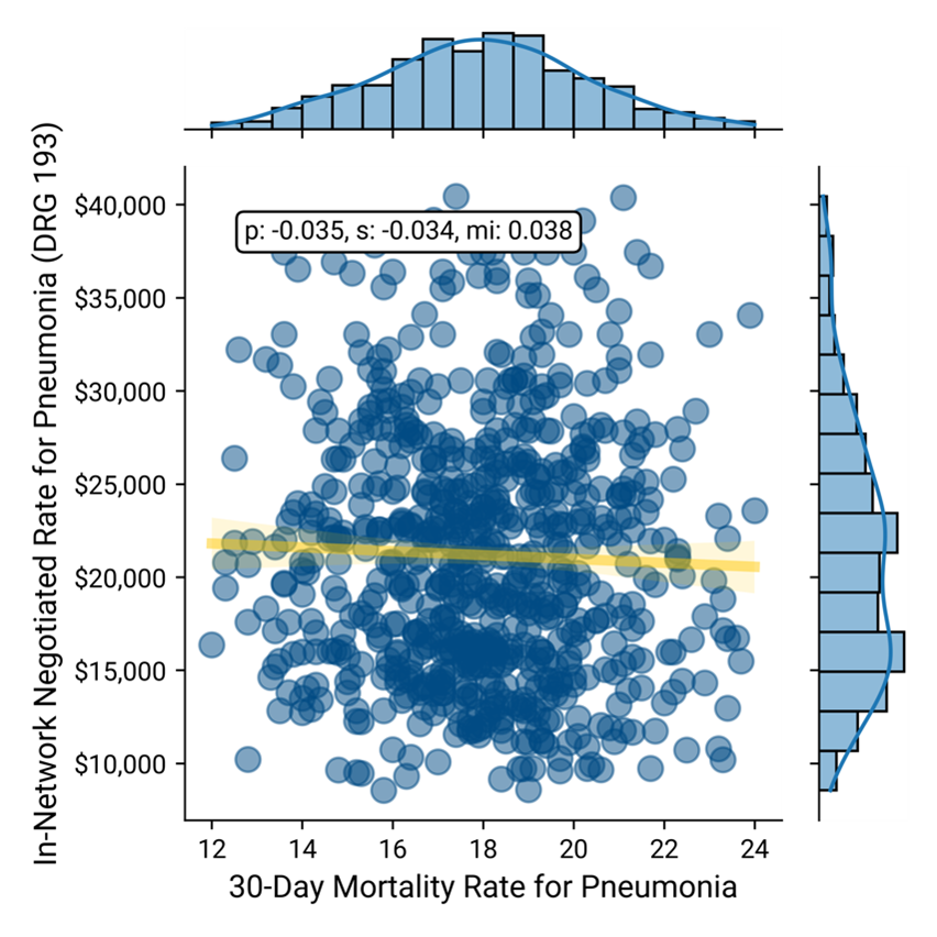
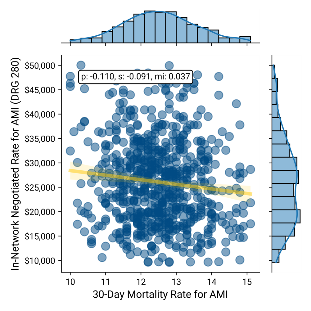
In each of the correlation analyses below of in-network rate vs the applicable quality measure, the X-axis represents quality, where a lower number is better. As a result, in these correlation analyses, the ideal correlation would be -1, which would demonstrate that as the rate increases, so does quality. Conversely, a correlation of 1 would demonstrate that as rate increases, quality decreases. In each example below, the slope of the regression line is “good,” but the correlations are “weak.”
Comparing the in-network negotiated rate for DRG 871 – Sepsis with central line-associated bloodstream infections (CLASBI) as a relevant measure of quality reveals a negligible correlation between price and quality.
Negotiated Rate for Sepsis vs. CLASBI
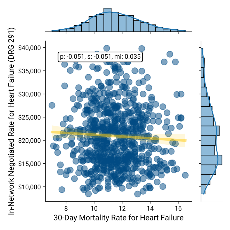
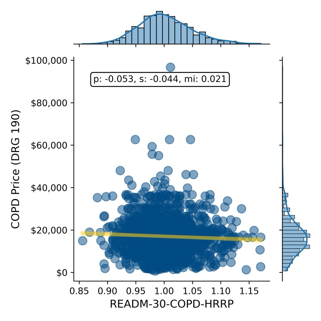
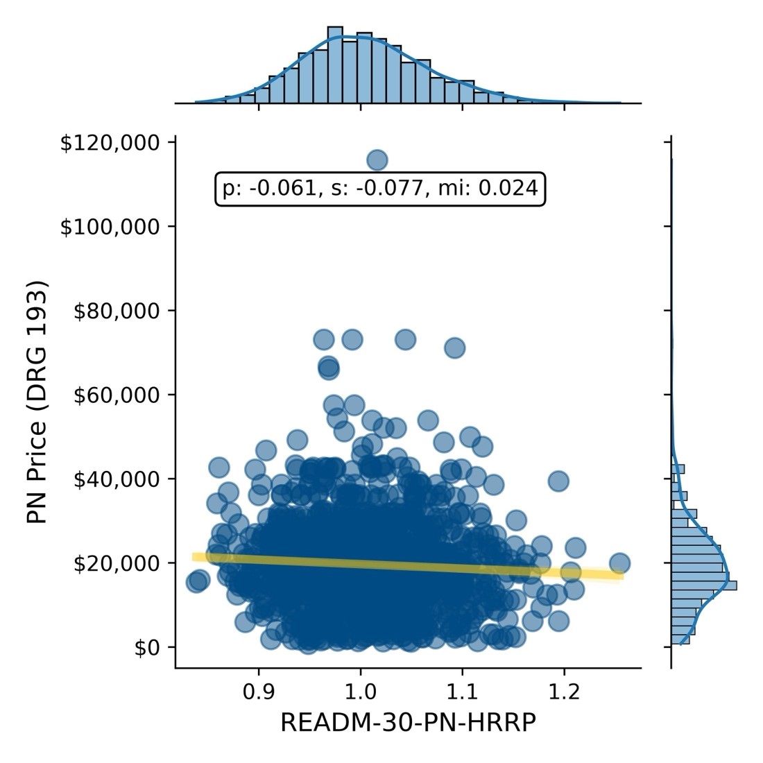
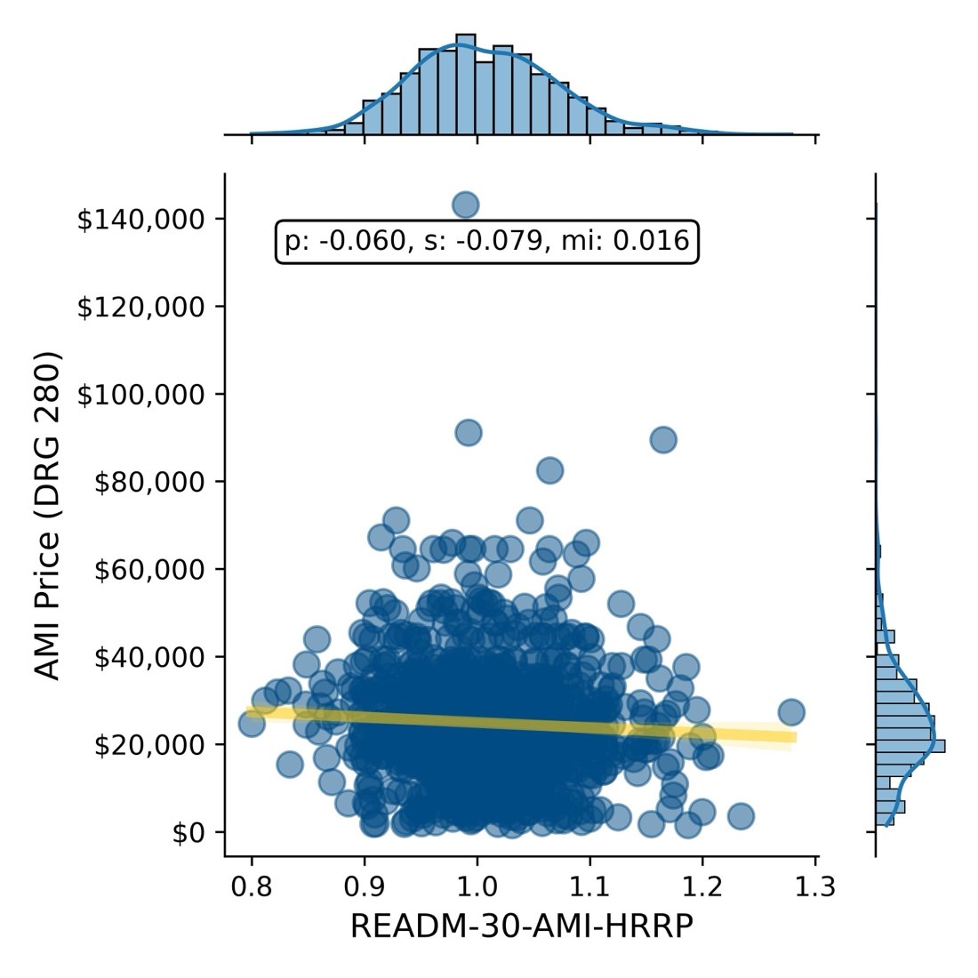
Similarly, comparing the in-network negotiated rates with the 30-day post-discharge mortality for DRG 190 – COPD, DRG 193 – Pneumonia, DRG 280 – Acute Myocardial Infarction and DRG 291 – Heart Failure, respectively, reveals a negligible correlation between price and mortality.
Negotiated Rate vs. 30-Day Mortality for COPD
Negotiated Rate vs. 30-Day Mortality for Pneumonia
Negotiated Rate vs. 30-Day Mortality for AMI
Negotiated Rate vs. 30-Day Mortality for Heart Failure
Similarly, in this example, using a combination of provider directory, health plan price transparency and CMS QualityNet data, the negotiated rate paid by a single national payer is compared to excess readmission ratios, another common quality measure, for the same four DRGs - DRG 190 – COPD, DRG 193 – Pneumonia, DRG 280 – Acute Myocardial Infarction and DRG 291 – Heart Failure, respectively, for more than 1,200 hospitals, revealing negligible correlation between readmission rates and reimbursement rate.
Negotiated Rate vs. 30-Day Readmission Rate for COPD
Negotiated Rate vs. 30-Day Readmission Rate for Pneumonia
Negotiated Rate vs. 30-Day Readmission Rate for AMI
Negotiated Rate vs. 30-Day Readmission Rate for Heart Failure

Negotiated Rate vs. 30-Day Readmission Rate for Hip & Knee Replacement
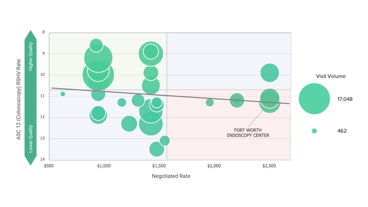
In this example, using a combination of provider directory, health plan price transparency and CMS QualityNet data, the highest value provider in the BCBS TX network for diagnostic colonoscopy in an ASC is 60% cheaper and significantly higher quality than the lowest value provider.
Quality vs. BCBS TX Commercial Visit Volume vs. BCBS TX In-Network Negotiated Rate for CPT 45380 – Colonoscopy in Dallas-Fort Worth-Arlington, TX CBSA
In summary, in every example above, a similar or identical quality outcome can be purchased at a range of prices that varies by as much as 7X.
While price transparency was designed to help consumers make more informed, price-conscious decisions, health plan price transparency is arguably more meaningful to employers, revealing the vast intra-market disparity in rates for identical healthcare services and providing pricing leverage they have never known they had. In every market, for every health care service, employers can, and will, require health care providers and health plans to defend their negotiated rates.
Providers charging premium rates must justify why they receive “Lamborghini rates” for “Buick quality.” Conversely, health plans must explain the broad range of rates they pay for identical services, especially in cases where they reimburse high-quality providers with lower rates and low-quality providers with higher rates.
Contrary to the guidance of consultants and health benefits brokers, leveraging price transparency and quality metrics to quantify “value for money” compels employers to seek broad provider networks, while designing benefits at the service-line level in every market to incentivize employees to use the best value provider, whoever and wherever they are.
Steps to Develop High-Value Provider Networks
- Employee Utilization Analysis
Gather internal data on healthcare utilization patterns among employees, including information on the types of services utilized, frequency of visits, costs incurred and outcomes. Analyze historical claims data to identify trends, high-cost procedures, frequent conditions and common healthcare needs among the employee population.
- Analyze Facility and Provider Quality
Utilize external market data to better understand quality metrics such as patient outcomes, readmission rates, infection rates, patient satisfaction scores and adherence to clinical guidelines to assess performance that the facility and individual provider level. Identify facilities and providers who consistently deliver high-quality care across a range of services and specialties.
- Evaluate Cost-Effectiveness
Leverage external rate data to assess providers and facilities based on cost-effectiveness. Key metrics should include negotiated rate per procedure, average cost per episode of care and overall cost. Consider providers and facilities who offer competitive pricing while delivering better than average quality in the target market.
- Design the Network
Leverage cost and quality outputs to design a network that balances accessibility and convenience for employees with the goal of minimizing costs without sacrificing quality. Consider factors such as geographic coverage, specialty services required and network adequacy.
- Collaborate with Healthcare Partners
Collaborate with health plans, third-party administrators and other healthcare partners to leverage their expertise and resources in building and managing the provider network to deliver value for money.
- Employee Education
Communicate the benefits of the provider network to employees, emphasizing the focus on value for money and, at a minimum, avoiding providers who deliver below-average quality at rates above the market median. Provide resources such as online tools, provider directories and educational materials to equip employees to make informed healthcare decisions within the network.
- Network Monitoring and Optimization
Implement systems for ongoing monitoring of provider and facility performance, including quality metrics and cost-effectiveness. Regularly review claims data and feedback from employees to identify areas for improvement and opportunities to optimize the network.